You are currently browsing the category archive for the ‘My house’ category.
Category Archive
Wallpaper for boys
January 19, 2010 in Color palette, Decorating, Design, My house | Tags: baby room, blue, cole and son, decor, Design, interiors, nursery, wallpaper | 9 comments
Plans for the new nursery are taking shape. But, in terms of execution, we’ve yet to so much as dampen a paintbrush. I’m stalling because I want to wallpaper one wall but, as ever, I’m lingering over the choice of wallpaper.
We’re going for pale blue, not because I’m a traditionalist, but because the walls are already the most gorgeous shade of summer sky blue (bizarrely, the shade is actually called Polar Sky). It’s the color our first son had and I can’t bring myself to get rid of it yet even though he’s graduated to more grown-up tones (which will be revealed soon, I promise).
But I still want to switch things up a bit with the addition of wallpaper on a single wall. The goal is to keep the look simple and sweet, but to get away from the bland and traditional. Basically, I want a cross between the purity of this scheme:
(Photo by Chris Everard via Sarah Kaye Represents)
And the quirky vibe of this room (minus the skull of course):
(Via Houzz)
Yes, I know, hard to imagine. But trust me, it’s going to work (I hope).
So, back to the wallpapers. The perfect choice has to be right for a child’s room but also for a grown-up space as we might turn the nursery back into a guest room one day. So no trucks, trains, planes, dinosaurs, ducks etc. It has to work for a boy, not just a baby, which means erring on the masculine side. It has to be fun, but not hectic. And it has to be blue! I started with this: Cloud Bay by Rapture and Wright, in powder.
Problem is, when I got the sample it just looked, well, dull. Plus, the blue was too green. It’s also very tricky to source this in the US – there’s one distributor and it costs a fortune to have it shipped all the way from the UK. So then I considered this: Daydream in China blue and orange, by Wallpaper Collective.
I still love this one and might come back to it. But it might be just a little too childish for our needs. I can imagine getting cheesed off with the birds in a few years. Then I hit on the idea of a more geometric design. I have loved Vivienne Westwood’s Squiggle pattern for ages and now it’s available in wallpaper from Cole and Son. But unfortunately it doesn’t seem to be available in the US and UK suppliers won’t ship it here.
So, finally, I’ve arrived at what is hopefully the perfect solution: Hick’s Hexagon in blue by Cole and Son.
I’m excited about this one and hope that the sample lives up to expectations when it arrives. What do you think? Any other options I’ve missed?
With any luck, we’ll have the decision made and will be flexing our paintbrushes very soon, so watch this space…
New year, new baby!
January 4, 2010 in Decorating, Design, Inspiration, My house, Personal | Tags: baby room, crib, decor, Design, interiors, kids room, nursery, rocker, wallpaper | 11 comments
Photo from Flickr.
I promised this year would entail some new challenges, and now I can finally reveal one of them. We’re expecting our second child in April! This explains the reduction in posts to this blog during the Fall: morning (ie all-day) sickness and fatigue do not mix well with blogging. But, with all that behind us, we’re looking forward to welcoming a new little boy into our family.
Photo via here.
Now, since this blog is all about interior design, most of my baby-related posts will be focused on his nursery and the other decorating projects a new family member entails. As any design-obsessed mother will know, a baby is a wonderful excuse to explore a whole new aesthetic (not to mention redoing a perfectly acceptable room in the name of ‘baby-proofing’!) In our case, it means redecorating three rooms. Our older son will move into the guest room, the guest room gets combined with the office and the new baby will take over my son’s old room. Bring on the paint chips and wallpaper samples!
Since I’ve had some experience decorating nurseries with baby number one, I can learn from prior mistakes. I’ll share those, and the inevitable new ones, on this blog. We’ve also nearly finished our first son’s new room so I can share those pictures soon. I promise not to let kid-friendly design take over, though – there will still be plenty of inspiration for grown-ups!
In the meantime, I’ll leave you with a few images of stylish nurseries. If I’m honest, I find it hard to find images of nurseries I really love and that balance both adult and baby needs – while also being suitable for a boy. Even these examples don’t necessarily satisfy the practical requirements of a modern nursery. More on that later. But they capture the right mood so, for now, enjoy…
A 1970’s nursery – yes really – via the Giggle nursery decor blog.
Via Sweetie Pie Pumpkin Noodle.
Via here.
Via here.
The ubiquitous image of Jenna Lyons’ nursery as seen in Domino (via here).
Lots to think about…
The smallest room
January 2, 2010 in Decorating, Design, My house | Tags: bathroom, black and white, Decorating, Design, ferm living, lamp, mirror, wallpaper | 7 comments
Bathroom, lavatory, loo, toilet, powder room, cloakroom – whatever you call it, decorating the smallest room in the house is not exactly the most romantic of design projects. Unless you live in the SF decorator showcase that is, and can powder your nose in this delightful space:
(Photograph by Elizabeth Fall)
In our case, our downstairs bathroom is not only the smallest room in the house but probably also the smallest room in the world. It’s billed as a quarter bath, which means it has nothing but a toilet in it. There isn’t even room for a washbasin (before you exclaim in horror, we wash our hands in the kitchen sink). Just to get into it, close the door and sit down, you have to perform a complicated maneuver, which requires practice. To make matters worse, the ceilings are so high that the space seems even narrower – a bit like being in a large vertical coffin. And it has no heating so feels like a Victorian outhouse in the middle of a British winter.
So why bother decorating it at all, you ask? Well, remodeling the layout is not an option at the moment, so I decided to make the best of the situation. If we can’t have a spacious bathroom with wide washbasins, fluffy towels and glamorous mosaic flooring, then we can at least have a space that doesn’t look like it should have strips of newspaper instead of bath tissue. This is how it turned out.
I chose the Bindweed wallpaper from Ferm Living for the walls above the dado rail. The bold black and white design brightens the space immensely and the pattern even makes the room seem larger. My husband spent the best part of a day putting the paper up, only to run out half way through the last wall. It was two days before Christmas so we had some shipped overnight (thanks to the very helpful folks at Branch) and he finished up the job on Christmas Eve. Now that’s true love: spending the day before Christmas in a freezing 5′ x 3′ space, suspended over the toilet bowl, wrestling with soggy wallpaper.
The lower walls show traces of one day being tiled but have been covered in layers of paint in varying shades of avocado and magnolia, so we just painted them white. The light fitting (this one from Lamps Plus) seems a particularly perfect match – it echoes the shape of the flowers in the wallpaper and, when lit, gives off a lovely dappled light (making it tolerable to spend more than five seconds in there).
Finally, the mirror is from the West Elm sale. We joke that it suits the room perfectly because it is probably the smallest mirror in the world. The actual glass is just about big enough for powdering your nose (because your nose is all you can see). But I like it so it has stayed.
So that, in a nutshell, is how we converted our ‘loo’ into a space to be proud of (well, not ashamed of at least). Fortunately, 2010 will bring some more ambitious and exciting decorating projects, details of which I’ll share very shortly…
Festive fireplace
December 28, 2009 in Decorating, Design, My house | Tags: decor, Design, fireplace, hearth, interiors, Living room, mantelpiece | 4 comments
I mentioned a few weeks ago that we were getting a new fireplace installed in our living room. Well, it ended up not exactly being a whole new fireplace, just a gas insert with logs. I know it’s not the same as a real wood-burning fire but it’s easier, cleaner, safer and slightly greener so worth doing. While we’re still all feeling relatively festive, I thought I’d share a picture of how it turned out.
Cozy huh? I must admit we used it far more than strictly necessary over Christmas. But there’s something so comforting about sitting around a fire in the evening with the family that we couldn’t resist. I haven’t posted much about our Christmas decorations, and now it’s too late, but needless to say, this was the major feature. Oh, and our gold and silver Christmas tree which just gets better every year as we add more ornaments (bought, bestowed and home-made by our toddler)…
The British tradition is to keep the decorations up until Twelfth Night (January 6th), so, as a committed fan of Christmas, that’s just what I’ll be doing. I promise not to keep posting about it though…
Blue (and red) for a boy’s room
October 11, 2009 in Color palette, Decorating, Design, My house | Tags: anthropologie, bed, Bedroom, blue, chair, decor, Design, ikat, interiors, kids room, nursery, polar sky, pottery barn, red, room and board, rug, toddler room | 7 comments
Our son recently turned three and is starting to outgrow his ‘babyish’ nursery. I’ve been thinking about how I’ll update his bedroom. To be honest, it’s a bit of a challenge. I want a look that will last a few years so it needs to be relatively age non-specific. But, then again, he’s only three so I don’t want it to be too grown-up for right now.
To add to the problem, he has an absolute passion for all things red. But everything in his room right now is pale blue. I’ve been wrestling with how to combine these two very different looks without it ending up looking like a Fourth of July parade. Then I spotted this room on Little Green Notebook, via Abbey Goes Design Scouting.
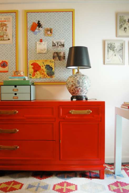
I absolutely love this room. It’s a home office, so obviously the requirements are very different to a kid’s room. But the strong colors and happy vibe are exactly what I’d envisaged for our toddler. They seem to sum up his personality instantly. Even better, this space shows that pale ‘baby’ blue and bright cherry red can look fabulous together.
So, I started putting a look together, using some of what we already have, and a few new pieces. This is what I came up with.
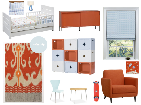
Ok, firstly, I realize the red here is a little more orangey. That’s more because that’s the shade of the items I was able to find in our price range. I actually like the orange tone, but a more ‘red red’ work work equally well.
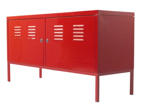
The starting point was the red cabinet. It’s the Halogen Credenza in Lobster from CB2. It’s $499 so not cheap, but it has tons of storage space. And I feel that sliding doors are much better for little fingers than drawers or chests that open at the top. I also like this cabinet from IKEA PS, but am not so sure about the lockable doors and dentable metal build!
The chair is also from CB2 and is $699. That’s actually one of the most reasonably-priced chairs I found that still looked modern and stylish. It’s comfortable too and I know he’ll love it because, well, it’s red.
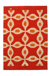
The rug is from Anthropologie and is $495 for the 5×8 size. I love the colors and the Ikat-style pattern – no kid-generated stains are going to show up on that thing! I also love this one, the ‘Ancient Languages Rug’ also from Anthropologie.
The storage unit in the center is my absolute favorite item, but, truth be told, probably won’t make the final cut due to price. It’s made up of Stella Stackable Storage Cubes from Q Collection Junior. At $365 per cube (with cabinet doors) and $315 without, it’s just way too pricey for a kid’s room. But I like the effect and plan to create something similar with an IKEA storage unit and some paint!
The bed is the one we have already. But I just ordered an Oscar twin duvet cover and sheet set from Pottery Barn Kids as most toddler bedding is too flimsy and small for winter. A twin duvet will be a little big but, folded over, it’ll work just fine. I love this set because it’s fun and childish, but not tacky. It’s not one that my son (or I) will tire of too soon. Here’s a closer look.

The little blue chair and round table are from Room & Board and are perfectly-sized for small kids. The ‘Jake‘ chair in blue is $50. You can get much cheaper ones but I like the idea of having this iconic chair shape in a child’s size. The table could just as well be a cheap coffee table from IKEA though, which is probably what we’ll end up using.
The window shade is from The Shade Store‘s Dwell Collection. I love this online source of custom blinds. We already have white drapes at the window and just need to update the black-out blinds. This fabric has pale blue giant polka dots so works well for a young child but won’t be too embarrassing when he’s 9!
And the best part of all is the fact that the paint color is the exact one we have in his room right now. Although you’d think ‘Polar Sky’ (from Benjamin Moore) would be a really cold shade, it’s actually a beautiful clear, warm shade with not a jot of gray in it. I did toy with going for a much brighter blue, like the shade in this room (via Flickr).
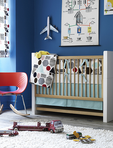
I call this shade ‘Carrie Blue’ because it reminds me of the color of Carrie Bradshaw’s made-over apartment in the Sex and the City movie (there’s something wrong about taking inspiration from SATT for your kid’s bedroom!). If I find a chair and cabinet in cherry red instead of lobster, I may still take this route because it’s such a beautiful color and will last him until his much older.
Anyway, so what do you think? Any great items out there I’ve missed to complete this look? It’s going to take me a few months to get organized so don’t expect pics of the finished space too soon! But I will post them as soon as it’s done, I promise.
Zebra rug for the living room
September 6, 2009 in Decorating, Design, My house | Tags: carpet, decor, Design, flooring, interior, Living room, rug, zebra print | 5 comments
Encouraged by the success of the zigzag rug in our playroom/little sitting room, I’ve finally chosen a rug for our living room. I went for the Zebra rug from West Elm in espresso and ivory. It’s a little smaller than I would have liked but, as standard sizes go, it’s not too bad.
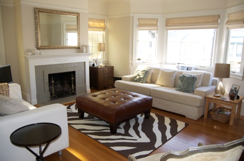
The room really needed some pattern and something dark to anchor it. But I’m now a bit concerned that the mantelpiece looks too bare or ‘staged’. I’d prefer to prop the mirror up against the chimney so it looks more casual, but, with an energetic toddler in the house, the thought of it crashing to the floor is just, well, let’s not think about it…
I was inspired in part by this image of stylist and blogger Erin Gates’ house, via Style Carrot. We have similar colors, artwork and textiles in our house so I guess I’m not surprised I loved her choice of flooring.
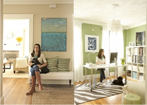
Anyway, hopefully this will satisfy my craving for graphic patterned rugs since any more of them might start to look a bit repetitive!
Yellow: conquered!
July 25, 2009 in Color palette, Decorating, Design, My house | Tags: Art, decor, Design, interiors, pillow, target, yellow | 14 comments
I’ve finally done it. I’ve introduced some yellow into our house. If you recall from this post, yellow has been my nemesis for years. But, I’ve taken the plunge and bought……..
….a pillow and a poster.
I know, pathetic isn’t it? It’s just a color so why all the drama? But, before you give up on me for good, hear me out. I tried for ages to find a Chinese cabinet in bright yellow lacquer – to no avail. Then I realized it probably wasn’t smart to splash out a ton of money on something I might very well want to smuggle down to the cellar and bury among the recycling three months later. So I’ve take some baby steps instead. Here’s the result.
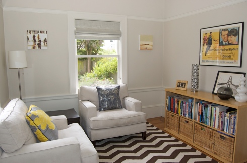
The poster in question is an original, advertising the 1963 movie Charade with Cary Grant and Audrey Hepburn. We found it in Westhampton. It’s a bit battered – it still has tape on the corners, presumably from when someone once stuck it to their bedroom wall. The pillow is from Target.
This is actually our sunroom – all the Edwardian houses in the area have this senselessly tiny room at the back of the house. It’s impossible to decorate and even harder to photograph. We use it as a playroom in the day and a kind of reading area in the evening (the toys are all stashed in the cube on the left and the baskets on the right). It has to be able to withstand a toddler hurling himself at full force around the place. (Yet another reason why a pricey chinese cabinet probably wasn’t a good idea – best to stick with the IKEA bookcase).
Anyway, so that’s my first foray into yellow. Hope you like it!
Hurray, finished the dining room
May 17, 2009 in Decorating, Design, My house | Tags: blue, chandelier, decor, Decorating, Design, Dining room, interior design, table | 4 comments
As I mentioned here, I’ve been revamping our dining room. Nothing major, mind you. Just a few tweaks here and there to finish the space. I’ve finally finished it and have some photos to share. It’s not an easy room to photograph so forgive the amateurish attempts. But you get the gist.
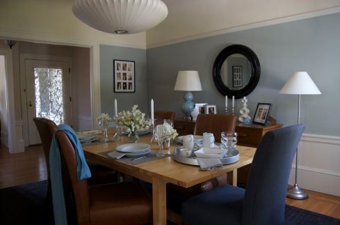
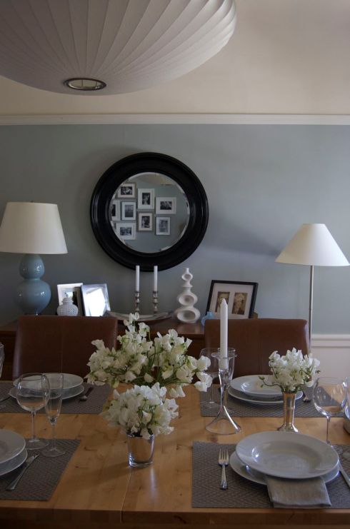
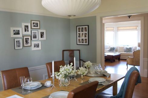
So, what did we do? Well, we replaced the Seventies brass and perspex chandelier with a Nelson saucer bubble lamp from Room and Board. We made the photo wall with frames from Aaron Brothers. The black round mirror was a bargain find from Lamps Plus. We bought the tall curvy vase from Wingard and the ginger jar from Bae Home in San Francisco. Oh, and we laid the table!
Garden makeover
May 3, 2009 in Decorating, Design, My house | Tags: backyard, Design, flowers, garden, patio, terrace | 2 comments
We’re all cooped up inside this weekend because of the wind and rain. But at least it means I have time to post about the work we’ve been doing in the backyard the past few weekends when the weather HAS been nice…
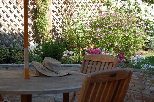
The garden is at the stage where we don’t have to do any major renovations. We can just potter about, adding new containers and planting flowers here and there. But it hasn’t always been like that.
When we moved in almost three years ago, this is what it looked like.
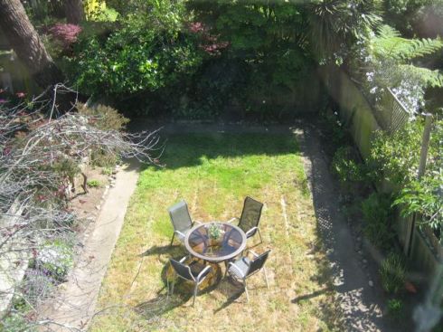
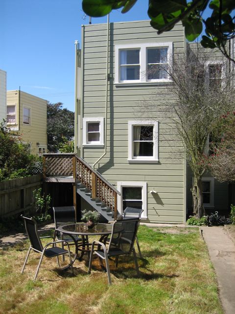
It had some nice trees (except for that one by the house which turned out to be dead – we had to cut it down). But it was mainly a rectangle of dried grass. You can’t really tell from these pics, but there was no patio or seating area, just a very narrow strip of cracked concrete where the steps end.
Eventually, we couldn’t take it any more. My husband got out the sledgehammer one day and smashed up the concrete path around the grass. He ended up with a huge pile of concrete slabs so we had to get a haulage company to take it away. We cut the flower beds and moved some of the turf about. We bought a few plants from homebase and turned the water on. In a few weeks (honestly) it looked like this. I guess it cost us about $500 to get it this far if you include the haulage, soil and plants.
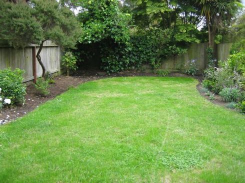
But we still had no patio or deck – just that narrow strip in front of the house. And we wanted somewhere to sit and read or have a BBQ, you know. So we drew some plans (on scraps of paper) then pulled out the check book and hired a gardener to dig out a space about 15″ deep, build a retaining wall and lay a patio. His team worked for five weeks on this.
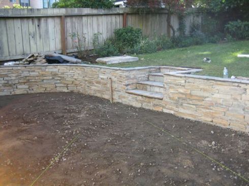
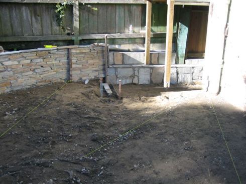
Then came the fun bit – choosing plants to put in the new walled beds and in containers on the patio. We’ve never had a garden before this so we’re not exactly expert gardeners. In fact, I am known for having a slight plantphobia (another story…) So it was very much a case of trial and error. We put in hebes, mexican sage, passiflora, wisteria, climbing roses, jasmine, an olive tree, lemon tree and lots of nemescia and abruscia. We also indulged in some ranunculus, delphiniums and anemones, which is a bit like gardening roulette – you never know which will survive and which will perish. Some didn’t…
Here’s what it looks like today.
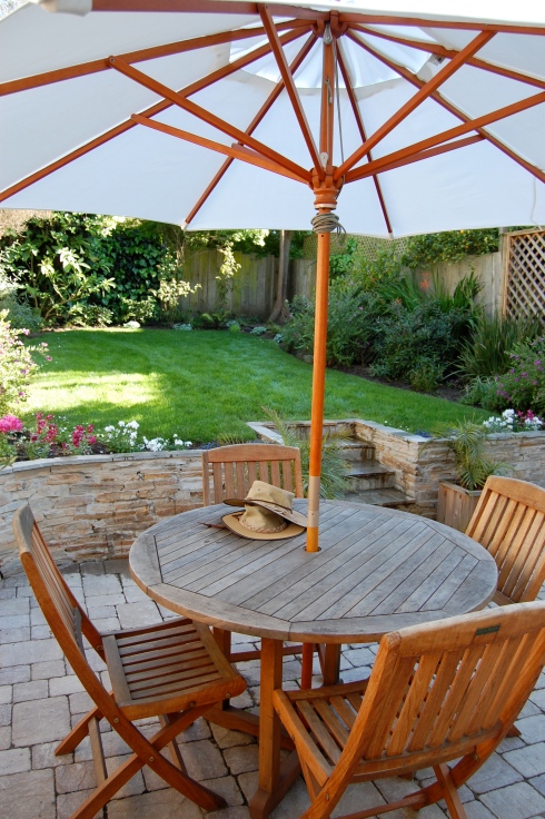
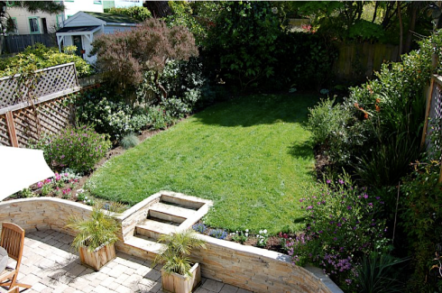
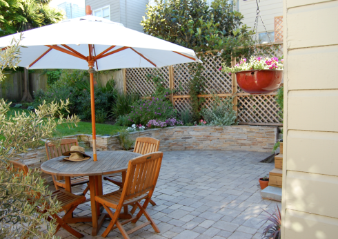

I still want to re-do the beds behind the retaining wall. They need to be a bit deeper – the proportions aren’t right at the moment. But it’s a big difference from before!
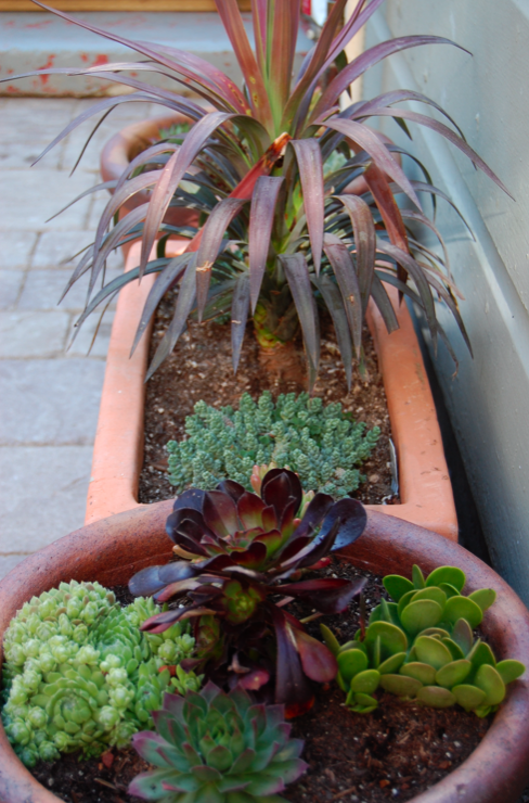
We’ve just put in a new trellis and a clematis and jasmine in containers next to it. We also created a mini succulent garden in containers on the patio. Even we can look after succulents.
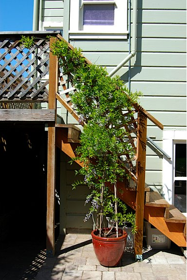
We still need to replace the railings by the steps and paint them (and possibly the steps). Not sure what color to go for though. Suggestions welcome. Here are the steps I’m referring to. Obviously we’re not going to paint the bit under the wisteria – just the railings on the other side.
Meantime, I’m enjoying pouring over the garden re-vamps at MadebyGirl (love the choice of blue) and DoorSixteen. Their progress is much faster than ours, of course. But we’re getting there…
Here’s one more shot, this one’s of the anemones. Enjoy!

Redecorating the living and dining rooms
April 19, 2009 in Decorating, Design, My house, Shopping | Tags: bird, bowl, ceramic, chandelier, Decorating, Design, Dining room, lamp, Living room, mantlepiece, mirror, pendant, pottery barn, restoration hardware, room & board, rug, vase | 3 comments
After much searching, I’m closing in on the makeover plan for our living and dining rooms. As I mentioned in this earlier post, I just want to update the look and inject some fresh energy into the house. No major furniture purchases and no painting allowed.
So, here was my action plan:
– (Finally) buy a rug for the living room – we’ve been looking for one for almost three years, time for a decision, I think.
– Replace the ugly chandelier in our dining room that came with the house.
– Make a photo wall with the various family photos we have scattered around.
– Clear some of the surfaces and re-arrange some of the accessories.
– Introduce some plants.
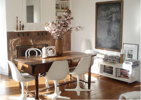
I struggled to reconcile several different design aesthetics currently buzzing around my head. For example, I’m loving the apartment of sfgirlbybay blogger, Victoria Smith.
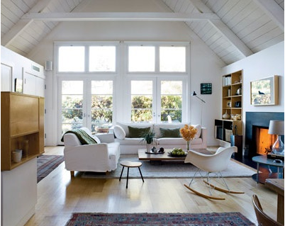
But I am also inspired by Remodelista blogger, Julie’s, house in Mill Valley (although obviously don’t have those stunning cathedral ceilings to work with!)
Finally, I found my inspiration in this picture, originally from Domino magazine, but found via Room Lust blogger, Javi’s, Flickr photostream.
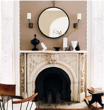
This look checks all the boxes for me: neutral colors, clean simple lines, organic shapes, with a bit of vintage.
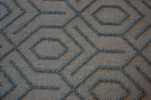
I started with the rug. We’re almost settled on this design from Schumacher. It’s a very pale creamy-white looped wool carpet which we’ll have made into an area rug (I know, with a toddler I must be crazy but bear with me…) and it has a light blue-gray pattern. Because of the pattern, stains are going to show up less.
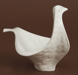
Then a bought this long lusted-after white bird bowl from Jonathan Adler.
I also have the vase I posted about here.
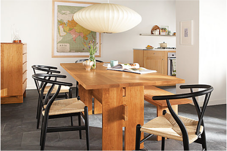
Then, for the dining room, we went all out and chose this pendant from Room & Board. It’s the Nelson Bubble Saucer Lamp. It’s pretty big (36″ in diameter!) so there will be no escaping its presence! But I love the organic shape. It wasn’t easy to get home though. I don’t think the sales associate appreciated the ten minutes spent trying to cram it into the back of my Ford Focus. That was after he allowed me 20 minutes in Room & Board’s stockroom hunting out different sizes so I could compare them. Being down there was like being in the world’s best flea market – every shelf had something cool to gawp at.
I am still looking for the right mirror. It needs to be round, with a black frame and very simple. A front-runner is this one from Restoration Hardware, apparently made from a Polish train wheel (?!).

Another option is the Channing Mirror from Pottery Barn.
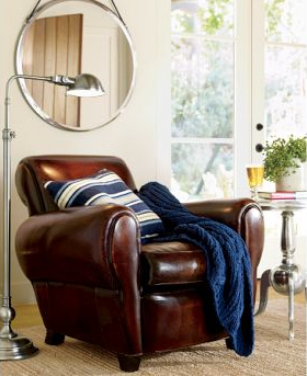
I love this one seen in Domino but don’t know where it is from:
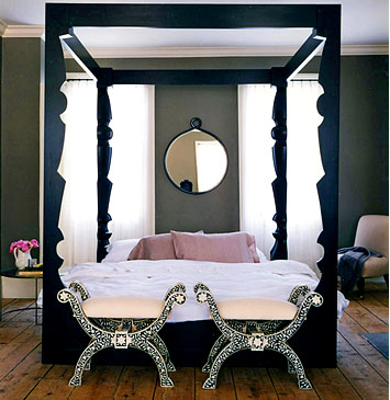
I’m not sure any of them are completely right. Any other suggestions?
I’ve also bought some frames ready to make our photo wall. We already have the photos so that will be a project for the next cloudy day…
Finally, the plants. We’ve chosen one: it’s called a Rhapis Palm. Now just got to source it at a reasonable price and get it home.
So, some progress made. I’ll post pictures once it’s all in place. I can’t wait to see it all come together.





Recent comments