You are currently browsing the category archive for the ‘Houses’ category.
Category Archive
How to Make Neutral Spectacular
January 16, 2012 in Decorating, Design, Houses | Tags: bathroom, decor, Design, house, interiors, Kitchen, Living room, marle, wallpaper | Comments closed
Here I go again – raving about the wonders of all-neutral interiors. But, seriously, this house (by Neuhaus Architecture and JP Warren Interiors) would persuade even the most vocal of the anti-beige crowd that pale is, indeed, interesting. The house, which was apparently decorated by the owner – the Jessica in JP Warren – was covered by Desire to Inspire back in June but it’s so beautiful I had to revisit it again here.
The architectural details of this house are extraordinary. All that molding, the fireplace, the pilasters. In my opinion, a brighter color scheme would be overwhelming. Instead, the muted palette just emphasizes all this lovely detail.
The floor is particularly attention-grabbing. I’ve no idea if this is original marquetry or whether it was installed, but it emphasizes and defines the shape of the space beautifully.
This is evidence that neutral interiors work best when there are unusual natural textures and materials. The combination of the vintage metal sinks with the stone wall is spectacular.
Then there’s this much more feminine bathroom. I can’t really say enough good things about this bathroom. I usually like my bathrooms to be more, well, bathroom-y. But, with its custom wallpaper and elegant furniture, this room might persuade me to change my opinion.
This is a less formal library space. The shelves cleverly fill an alcove and the diagonal furniture arrangement is a good way to fill such an enormous room without over-cluttering.
More natural stone at work here. Waterfall countertops really elevate the design of a kitchen and this is no exception. It is an usual space for a kitchen. With the bay window, it looks more like a living room. The designer has addressed this by keeping the cabinetry very simple and more like furniture.
This is my favorite view of the whole house. A simple cube-shaped set of shelves (but obviously completely custom) with an artfully arranged collection of white ceramics. Very pleasing to the eye.
What I like most about this home overall, is that each room has its unique personality, and yet the whole scheme is cohesive. Do you have a favorite room?
Photo credit: Peter Margonelli
Luxurious Ski Lodges
December 5, 2011 in Decorating, Design, Houses, Inspiration | Tags: alpine, chalet, decor, Design, interior, mountain home, ski lodge | 4 comments
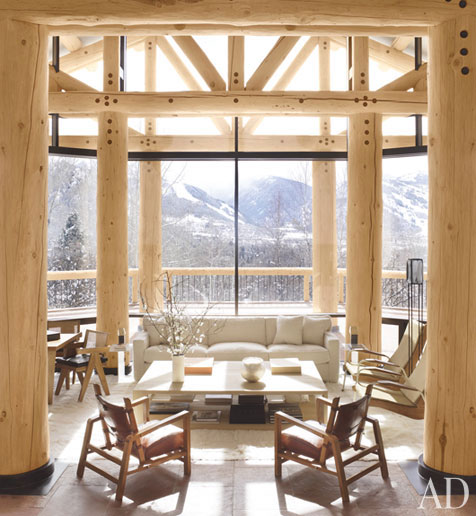
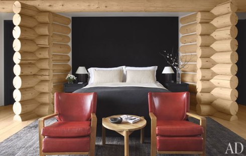
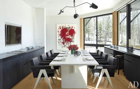
It’s at this time of year I start thinking about ski chalets. Not your typical A-frame alpine cabins, mind. I mean expansive wood structures with soaring ceilings, incredible views, and open fireplaces. So I was happy to discover that this month’s Architectural Digest has just such a home on its cover. Now this is my idea of a ski chalet!
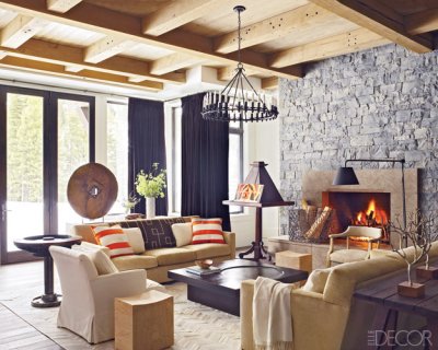
What a great juxtaposition of mid-century and contemporary with traditional craftsmanship. The architect somehow manages to incorporate those solid wood beams while keeping the overall effect light and airy. It’s a great color palette too. It reminds me of that other great ski chalet from last year’s Elle Decor. Who could forget this?
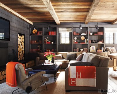
And this month’s Elle Decor has a Montana ski lodge with a similar palette, dark fire surround and beamed ceilings.
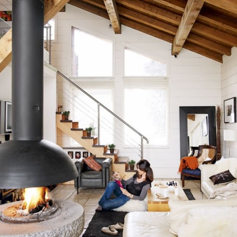
This modern interpretation of a ski lodge, from Living Etc, also has my vote:
Looks like it’s time to dust off those skis!
Modern ski lodge
February 2, 2011 in Decorating, Design, Houses | Tags: architecture, decor, Design, fireplace, house, interiors, Living room, ski lodge | 5 comments
We’re going skiing at the end of February but, sadly, we’re not staying here…
This Tahoe home is the work of John Maniscalco Architecture (also on Houzz). I love the way all the traditional features of an alpine cabin – from the wood-clad walls to the fireplace to the fabrics – are reinvented with a more modern twist. Just beautiful.
We, on the other hand, are staying in a much more traditional cabin. Hopefully it will be nice all the same!
A red and gold apartment scheme
September 9, 2010 in Color palette, Decorating, Design, Houses, Inspiration | Tags: apartment, decor, Design, gold, interiors, moss green, otomi, red, west elm | 7 comments
A few weeks ago my sister asked me to help revamp her Manhattan apartment. Only trouble was, I wasn’t planning to head out East and so any help I could offer had to be remote. Luckily, my sister has excellent taste and so all she needed was some help in bringing her ideas together into a cohesive scheme. Sometimes, all it takes is a fresh pair of eyes…
She didn’t want to replace any major pieces and was limited on the decorating front by the fact her place is a rental. But she did want it to be more pulled-together and ‘grown-up’. It also had to function for a 20-month-old.
My sister loves eclectic spaces with anything from French to Moroccan to Asian influences. She also describes herself as a ‘color tart’ (!), loving pretty much any color under the sun. How to combine all this into an open plan apartment?
As a first step, she sent me a couple of images of rooms she liked, answered some of my questions and then I created an inspiration board (above). The goal here was to consolidate all the hundreds of ideas racing round her head. We found that warm colors, luxurious textures and pattern were recurring themes.
Then we built the color palette, based on the inspiration board. I felt that a relatively complex palette was needed in order to accommodate her love of color. It also needed to complement some of the existing hues in her space – chiefly the moss green. Pinky-red, gray and taupe were perfect solution. I also wanted to introduce gold for that luxe element. Finally, I felt that some rich, ethnic-inspired embroidered textiles would be the way to introduce pattern without looking too cluttered.
Finally, we put together selection of furniture and accessories to complement what she already had. Product details are below.
A big focus was the TV area, which needed organizing and defining. I found this room (via MadebyGirl), which inspired an asymmetrical arrangement of shelves and a media console around the TV:
She’s still working on implementing the ideas so we’ll have to wait and see how it turns out. But it was fun to pull together and a great example of bi-coastal sibling collaboration!
Here are the product details:
1 – Lamp
2 – Media cabinet
3 – Pillow
4 – Side table
5 – Lamp
6 – Tray
7 – Bus stop sign
8 – Pillow
9 – Lamp
10 – Vases
11 – Pillow
12 – Tray table
13 – Media cabinet
14 – Lamp
15 – Pillow
16 – Pillow
17 – Otomi textile throw
18 – Ikat chair
19 – Lamp
20 – Pouf
An eclectic family home
July 12, 2010 in Between these four walls: house tours, Decorating, Design, Houses, Inspiration | Tags: bathroom, decor, Design, interiors, Kitchen, Living room | 6 comments
I love stumbling across beautifully-designed ‘real’ homes on Flickr. So I’m crazy about this refreshingly eclectic place. It’s owned, and impeccably styled by Yvonne, who also blogs about her travels, family, crafts and home on her blog, Moline. Yvonne has lived in Germany, Istanbul and Mexico and her style is clearly influenced by all three locations. Yvonne was kind enough to let me post some images from her past and present homes.
For starters, isn’t this a glorious blue for a kitchen? The color was inspired by Yvonne’s time living in Mexico. I’m into the open shelves, mini pendant lights, tiles and extra-long cabinet hardware.
If you’re going to have open shelves in a kitchen, you’ve got to buy groceries that look like this.
Moroccan tea tray tables always look great, but this one, which happens to be Turkish, looks spectacular under this chandelier. What a great juxtaposition of styles.
Here a vintage champagne bottle holder has been converted into magazine storage/installation art. So cool!
More inspired styling – spring in letter and in spirit!
A great art wall looks even better over a geometric dresser.
Cozy sheepskin rugs on wicker chairs? That’s one way to ensure your home works as well in the winter as the summer.
We’ve all seen oversize maps used in kids’ rooms, but this looks particularly cute against the blue wall and with the patchwork bedding.
So much to love about this bathroom: the smooth modern tub and basin, sloping roof, low windows… It all spells peace and quiet.
I like the way this photo wall meanders up the stairs, with plenty of space for future pics.
These are hand-painted porcelain eggs, suspended to look like a chandelier. So beautiful…
If you like Yvonne’s style (and who wouldn’t?) she also has an Etsy store – check out the stunning bird and butterfly collages. I’m sorely tempted to buy one of the bird ones for our little boy’s nursery…
The perfect summer palette
June 8, 2010 in Color palette, Decorating, Design, Houses, Inspiration | Tags: bathroom, Bedroom, decor, Design, green, interiors, Kitchen, Living room, loft, pink, white | 4 comments
I’m always drawn to modern white spaces with the simple, uncluttered look. But, at the same time, I know if I lived in one I’d long for a splash of color and a more casual vibe. This house is, to me, the perfect compromise. The combination of white gloss, horizontal lines and low-slung furniture with characterful accessories in fresh pink and green is just stunning. It would feel like summer year-round in this house, wouldn’t it? (From Micasa Revista via Achados de Decoracao).
The key to this space is the styling. The essentials are all neutral but it’s the pillows, blanket and flowers that inject color. The boxy sofas are tastefully restrained but the tropical print cushion and the chartreuse floor pillows just say ‘relax’.
A glimpse of the kitchen shows it’s just as minimal, with glossy white cabinets and a stainless steel hood. The use of drawers instead of traditional cabinets creates more horizontal lines to echo the living area’s low-key, loungy feel.
I love these blue-gray light shades in the kitchen. I bet those bar stools actually live on the other side of the island though and are just placed there for the photo…
This bedroom actually has many of the things I tend to steer clear of: very low beds, multiple pillows, teeny tiny rugs… But the effect here, in the context of the rest of the space, is great. And that color palette again!
Now this is a bathroom to hang out in! Huge limestone tiles and sleek white drawers create yet more of those horizontal lines. And, yet again, it’s balanced with a little bit of handcrafted character in the form of the crochet basket and perfume bottles.
Although it looks effortless and laid back, this space is actually a triumph in attention to detail. The fact that there’s so much continuity from room to room no doubt adds to the relaxed feel. And the fresh colors and abundant light make this place almost as good as being outdoors on a summer’s day. Almost!
Black and white house
April 11, 2010 in Color palette, Decorating, Design, Houses, Inspiration | Tags: bathroom, black, black and white, chandelier, decor, Design, Dining room, interior design, Living room, wallpaper, white | 3 comments
After the florals and frills of the last few posts, I’m feeling the need to highlight some rooms with a more edgy aesthetic. (Maybe it’s the nesting instinct that’s drawing me to clean-lined, minimal spaces!?) Luckily, I came across this stunning house by designer Nacho Polo on Vintage + Chic, which fits the bill entirely. Cool, calm, collected and utterly stylish. Not sure I could live in it, but I sure wish I had the discipline to create something this stunning.
This is my favorite room. I love those dining chairs.
Interesting use of contrasting shapes here. It makes the simple color scheme more exciting.
Clever to use the all-white frames as a form of art in itself.
Love that black chandelier and rococo wallpaper in an otherwise modern minimalist bathroom.
Even if you can’t handle black and white in every room, I think it’s perfect for making the most of a small bathroom.
What do you think? Could you live here? And even if not, wouldn’t you love to visit?
Beach house gem
March 4, 2010 in Decorating, Design, Houses | Tags: amy lau, beach house, Bedroom, decor, Design, interiors, kara mann, kelly wearstler, Living room, ocean villa | 6 comments
Just thought I’d share a few images of our little beach house…
Just kidding, of course. While I wish with all my heart that this place was ours, it is actually a home from the portfolio of designer Kara Mann.
If I did have a stunning ocean-front villa, though, I’d want the combination of Moroccan shapes, ethnic textiles and rough-hewn textures Mann uses in this home.
And a bedroom with an ocean view, like this.
And a sense of light, space and charm as soon as you set foot through the door…
And I’d be very happy if it combined elegant neutrals with eccentric splashes of color, like this.
I doubt my guests would complain if they had to sleep here.
I came across Kara Mann’s portfolio in a rather circuitous way. I was browsing The Inside Source, a new blogazine from eBay, and read about Kara in a post by Marni Katz, who also runs one of my favorite blogs, Style Carrot. Off I went to Kara’s web site, where I was instantly smitten. Not that I’m claiming to have discovered a little-known designer. On the contrary, Kara is one of the most lauded designers out there – having won awards from InStyle, Vogue, Met Home and numerous others, as well as having her work featured in most of the top design publications.
It’s not hard to see why. Kara’s portfolio is full of the kind of upmarket homes most people can only dream of. But there’s nothing sterile about these places: each has its own unique personality combining texture in a way that is reminiscent of Amy Lau with the glamor of a Kelly Wearstler creation.
Despite the aspirational quality of her spaces, they all have ideas that us mere mortals can apply in our own homes: from the styling to the color palettes. So, although this is not our beach house and it’s unlikely ever to be, I can still hold onto the hope that, some day, I’ll incorporate some of this style into my own place. We can all dream, can’t we?
A cool and quirky architect-designed home
January 17, 2010 in Decorating, Design, Houses, San Francisco Design | Tags: architecture, Art, Bedroom, decor, Design, Dining room, house, interiors, Kitchen, Living room, stairs | 3 comments
I find architects’ web sites to be a great form of escapism. Who wouldn’t appreciate the fabulous images of pristine homes, just ready for the owners to move in and make their mark? But, despite all the soaring ceilings and glossy kitchens, the images are often rather soulless. Just that little bit too perfect, perhaps. That’s why it’s such a delight to explore the portfolio of Feldman Architecture, a San Francisco-based firm which consistently delivers sustainable, beautiful, yet personal homes. Its pages are filled with images of furnished houses that display the interests and styles of their owners. At the moment, I’m particularly captivated by this gorgeous home in the hilly neighborhood of Bernal Heights.
The house was a dark, near-derelict 1860’s cottage. The challenge was to maintain the rustic charm, while opening up the space and injecting it with light.
I love the use of rough stone and wood, with more polished glass and metal – and those enormous sliding doors opening directly onto a deck.
The house is filled with quirky art and furnishings – those chairs are a surprising combination with the modern sofa.
The house seems to have two office spaces. This light-filled area would provide plenty of inspiration for working.
More skillful combinations of materials: rough-hewn wood, slate and lucite.
I love the red, gray and white of the master bedroom. The shelf above the bed is a really simple way to add interest – something I think I might do in our guest room. I must also make it a life mission to track down those lamps!
To my mind, this is the perfect chill-out bathroom.
The nursery is, as you’d expect, a departure from the rest of the house aesthetically-speaking. But it still has a cool vibe and clear sense of personality. Having nurseries on my mind, I’m appreciating the child-friendly storage ideas and the way the brown puts a grown-up twist on baby pink. Shame I’m having a boy, otherwise I’d pinch some of these ideas!
And just to prove this house has everything – a fabulous double-height library!
This home is a wonderful combination of old and new, inside and outside, cool and quirky. You can see more of Feldman Architecture’s work here.
These four walls: Sarah and Danny’s house tour
November 13, 2009 in Between these four walls: house tours, Decorating, Design, Houses, San Francisco Design | Tags: Bedroom, decor, Design, Dining room, house tour, interiors, Kitchen, Living room, mid-century, san francisco | 8 comments
It’s been a while since the first post in my house tour series, so it’s high time for another one. If you recall, my goal with this series was to show how real people live stylishly, and how different homes can really show the personalities of their owners. The home we’re touring today is no exception.
We’re visiting Sarah and Danny’s house in the East Bay, near San Francisco. Sarah and Danny’s story is a familiar one for many young families. Having spent years living in San Francisco itself, the time had come to escape the big smoke. As if having a two-year-old wasn’t enough reason to start looking for more space, the chaotic housing market in San Francisco made buying a first place in the city even more perilous. So Sarah and Danny headed for the hills – literally. They ended up buying a mid-century modern home high up in the El Cerrito hills, near Berkeley, with the most fabulous views over San Francisco Bay. In fact, it was the view that convinced them there was more to life than city-living.
Of course, the house itself played a big role in convincing them too. Sarah says they both instantly felt at home here. It’s easy to see why.
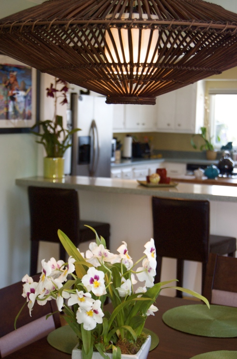
Sarah describes their style as ‘global modern’ and I couldn’t agree more. Hardly surprising when you consider what these two do for a living. Danny is a horticulturalist and Sarah works for a global non-profit, a job which requires traveling to Africa and Asia. The house is filled with the couple’s collections of exotic plants, orchids, fossils, stones and statues. Yet, it’s still a welcoming house, suitable for a toddler (and some chaotic, toddler-filled parties!)
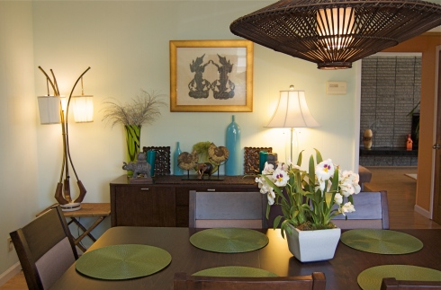
At the heart of the home is a huge, open kitchen and dining room. The latter area is a perfect example of the couple’s style. But, although it looks like everything came from some far-flung place, in fact there are several canny local purchases here too. The vintage floor lamp was a gift, but the pendant shade was from Z Gallerie.
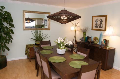
And this cute little guy was from World Market!

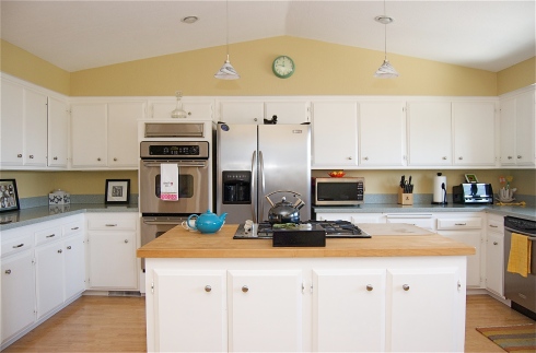
Most San Franciscans would kill for a kitchen like this. Sarah and Danny repainted all the cabinets, but the floor plan was in place when they moved in. I like the huge crystal – citrine quartz, from Living Green in San Francisco – and the way it glows like kryptonite under the lights. The art on the left (just seen) is actually a photo of graffiti in SF (a little reminder of urban life?) The orchids are all by Danny. If, like me, you can’t keep an orchid more than two weeks you’ll appreciate how handy it must be to have a horticulturalist around the place. (Email me if you have inquiries about the orchids).
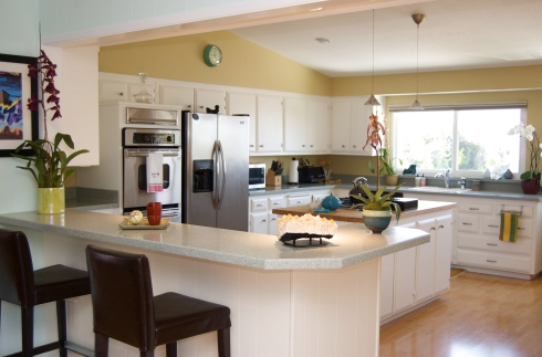
I expect this kitchen made leaving San Francisco a lot easier. There’s even room for the couple’s little girl to have her own toddler kitchen in the corner.
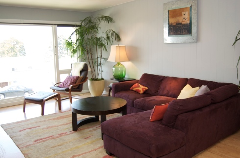
The living room is very mid-century with those vast windows (overlooking the Bay). It’s truly a place to chill out and enjoy the view. Sarah says they often feel like they’re on vacation when relaxing in here. Like the dining room, this space uses a clever combination of finds and buys. The green glass lamp base was actually salvaged from a street corner.
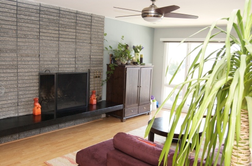
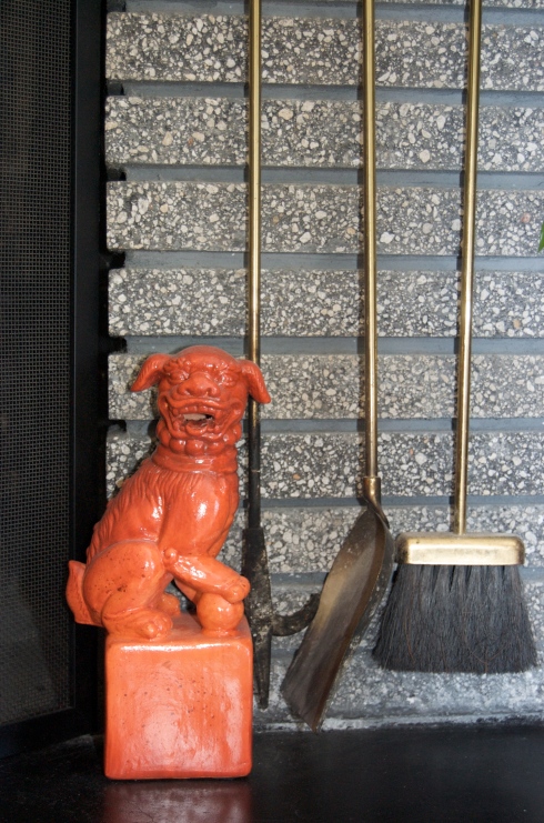
The gray brick fireplace is original to the house. The orange dogs are from Pier One.
And the 50-year-old Buddha was a gift from a friend who bought it in Vietnam.
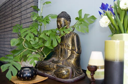
Here’s a closer look at the orange Staffordshire dog. Quite the cheeky pup, this one!
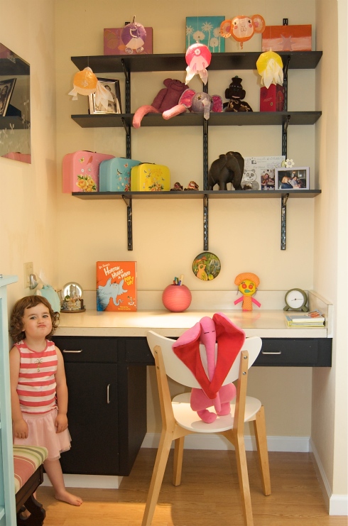
And here, posing for the camera, is the reason for the big move! Sarah and Danny’s daughter proudly shows off her bedroom, which is a treasure trove for little girls. I love those little suitcases – they’re from Noodle Soup in Corte Madera, just north of SF.
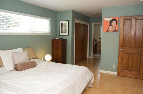
Sarah and Danny chose deep greens and oranges for their walls. The effect is restful in the master bedroom.
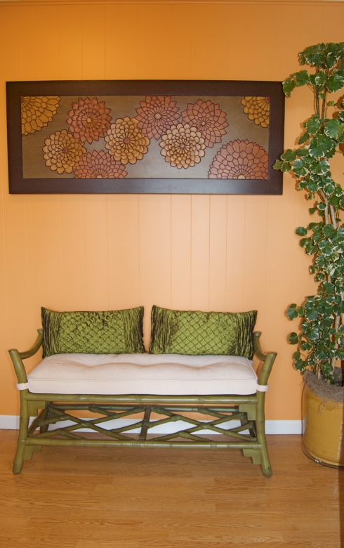
And welcoming in the entryway.
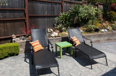
Outside, there’s a patio for BBQ-ing and a lawn for playing. Plus, there’s another benefit of moving out of the city: sunshine!
And so, back to that view. Quite apart from the space the new house provides – perfect for hide and seek, apparently – it’s easy to see why Sarah and Danny were able to move away from San Francisco. They may have left the city behind, but the view meant it was never out of sight.





Recent comments